
The second week of Winter in South Australia was quite chilly with several days reaching a daily maximum temperature of only 15C with typical minimum temperatures of around 9C. Despite the cold weather, electricity prices remained relatively low, by South Australian standards, with an average wholesale electricity price of $73.37/MWh (7.34 c/kWh). The driver of the lower prices was a relatively high and stable level of wind generation.
Figure 1, below, shows the distribution of half-hour pool prices in each day of the week beginning on Sunday 10th June. Box plots as explained in this post, are a great way of visually analysing a large amount of data and studying data distributions and volatility. There are 336 data points reflected in the box plot below. The red line is the average price on each day.
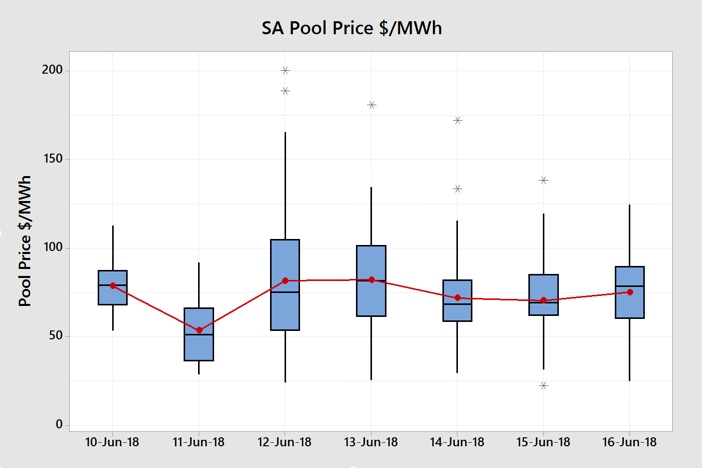
Figure 1 Daily SA Electricity Price Box Plot (Data Source: NEMReview)
We can see that prices dropped substantially on Monday 11th June and were relatively more volatile on Tuesday 12th and Wednesday 13th June. If we look at the box plot for daily wind generation over that same period in figure 2 we can see the link between wind generation and price.
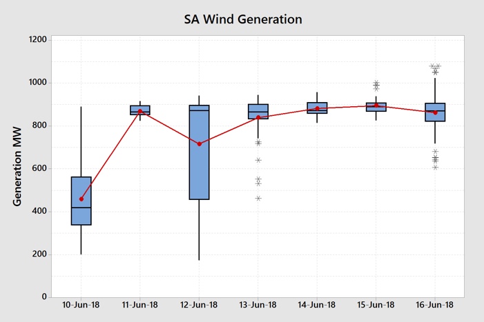
Figure 2 SA Daily Wind Generation Box Plot (Data Source: NEMReview)
On Monday 11th June the wind generation was quite high and very stable relative to typical daily wind generation output. This resulted in the sharp drop in prices. On Tuesday 12th the wind generation output was more volatile leading to more volatile prices. Wednesday 13th saw the wind return back to the previous high level reducing the price volatility. The remainder of the week had very stable wind generation and low price volatility.
Figure 3, below, shows the time series plot of half-hour wind generation and how the wind dropped off on Tuesday and picked up again on Wednesday.
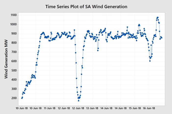
Figure 3 Time Series Plot of SA Half-hour Wind Generation (Data Source: NEMReview)
The high level of wind generation relative to the demand drove out a lot of gas-fired generation this week. The time series plot clearly shows how sharply wind generation dropped away on the 12th and then quickly picked up again of the 13th June. We can see how the high level of wind generation affected output from each of the different forms of generation in the series of charts below.
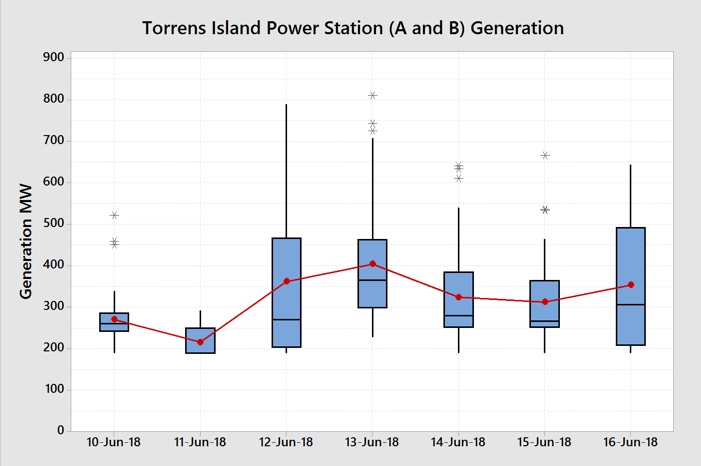
Figure 4 Torrens Island Power Station Generation Output Daily Box Plot (Data Source: NEMReview)
The Torrens Island Power Station (A&B) was the dominant generator during the week but its output was relatively low at between 200 and 500 MW for most of the week. Its output on Monday 11th was low and very stable but it was also largely the only form of generation outside of wind generation.
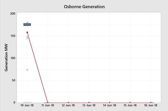
Figure 5 Osborne Power Station Generation Output Daily Box Plot (Data Source: NEMReview)
The Osborne Power Station ran very consistently on Sunday 10th but then dropped to zero for the remainder of the week. This was probably for planned maintenance.
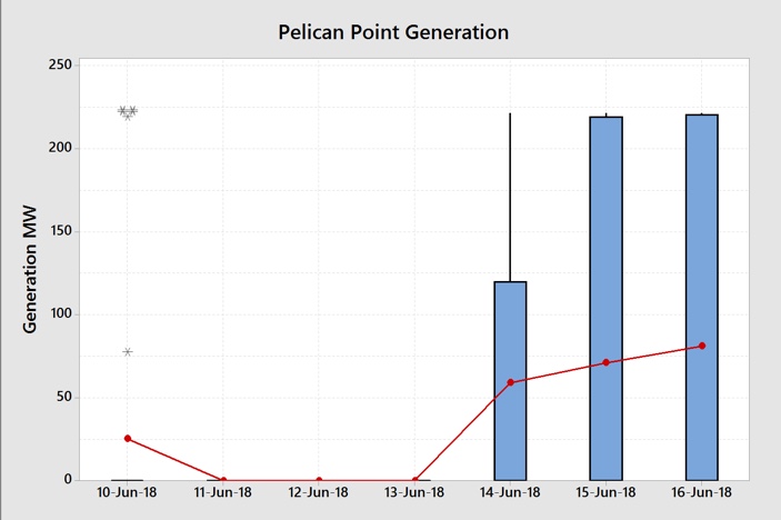
Figure 6 Pelican Point Power Station Generation Output Daily Box Plot (Data Source: NEMReview)
Pelican Point Power Station operated when required on Thursday 14th through to Saturday 16th June. We can see how the station ramped up to full output and then shut down on each of those days in the time series plot shown in Figure 7 below.
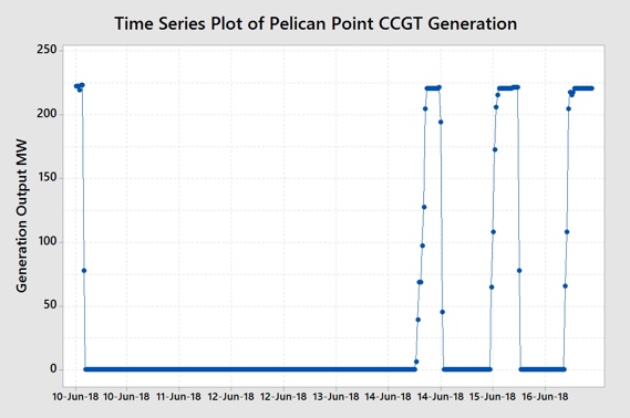
Figure 7 Pelican Point Power Station Generation Output (Data Source: NEMReview)
As Pelican Point is a Combined Cycle Gas Turbine (CCGT) plant, it can only slowly ramp up to its full efficient output. Open Cycle Gas Turbines (OCGT) are the generators that respond quickly to changes in demand. Figure 8 shows the use of OCGT through the week by means of the box plot and Figure 9 shows the time series plot of OCGT output.
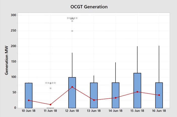
Figure 8 Open Cycle Gas Turbine Generation Output Daily Box Plot (Data Source: NEMReview)
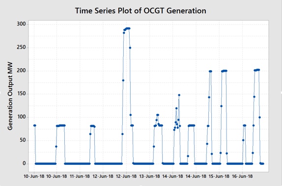
Figure 9 Open Cycle Gas Turbine Generation Output Time Series Plot (Data Source: NEMReview)
Figures 8 and 9 show that there was almost no OCGT generation on Monday 11th June but generally consistent generation on the remaining days. What is more evident in the time series plot is that specific generators would ramp up quite quickly during the higher demand periods to particular output levels (80, 200 and 290 MW) and then turn back off. Those specific generators were exclusively at the Ladbroke and Quarantine Island Power Stations.
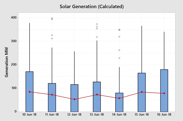
Figure 10 SA Solar Generation Output (Calculated) Daily Box Plot (Data Source: NEMReview)
Figure 10 shows that solar generation output varied from day to day with lower output on Thursday 14th June and higher output on the 10th, 15th and 16th June. It also shows that solar generation is an important contributor to total generation in South Australia.
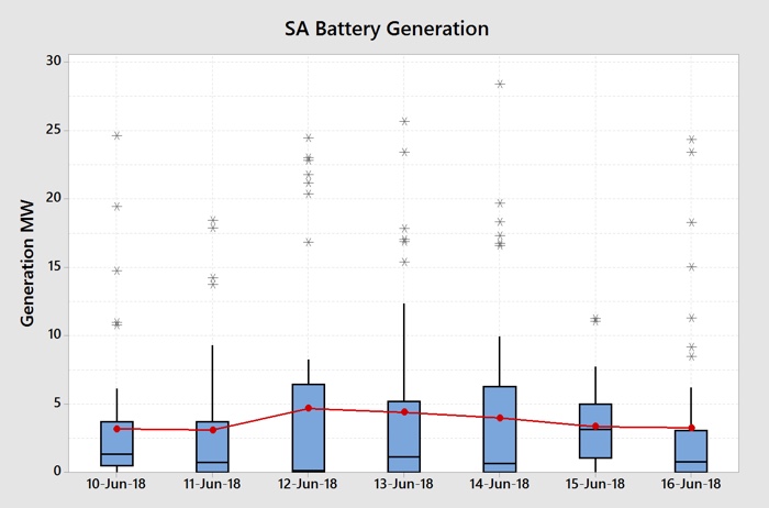
Figure 11 South Australia Battery Output Daily Box Plot (Data Source: NEMReview)
Figure 11 shows a fairly consistent output from the Big Battery with discharge times aligning with high demand periods and the batteries recharging during the lower demand, and lower price, periods.
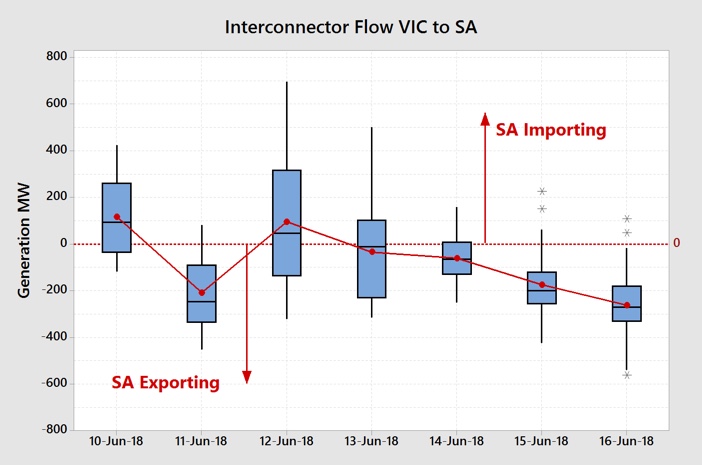
Figure 12 Interconnector Flow From Victoria to South Australia Daily Box Plot (Data Source: NEMReview)
The interconnector flows (Heywood and Murraylink) from Victoria to South Australia shown in Figure 12 reflect the level of wind generation with exports occurring during the high wind generation periods and imports occurring when the wind generation dropped away.
We can see the sum of all of the generation output in Figure 13 below. We can quite easily visually see that most of the demand was met by wind generation (light blue) and the Torrens Island Power Station (TIPS – light green). We can also see the daily influence of solar (orange). There was no diesel generation during the week.
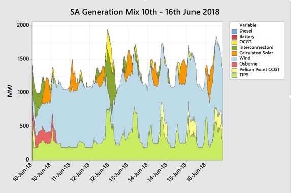
Figure 13 South Australia Generation Mix 10th June – 16th June 2018 (Data Source: NEMReview)
How did the generation mix resolve into a wholesale market pool price outcome for the week?
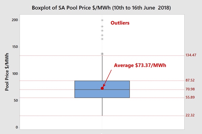
Figure 14 South Australia Weekly Wholesale Pool Price Box Plot (Data Source: NEMReview)
The box plot showing all of the half-hour periods shows an average price of $73.37/MWh and a median price of $70.98/MWh. The number of price spikes above the upper whisker was only seven and they were all small in magnitude and so the average price was close to the median. The whole distribution of prices shifted downwards compared to last week due to the high and consistent wind generation. 75% of all of the half-hour periods were below $87.52/MWh.
Figure 15 shows how those half-hourly prices were distributed by time of day for the week.

Figure 15 South Australia Wholesale Pool Price By Time Of Day (Data Source: NEMReview)
Figure 15 shows that the higher prices occurred, as expected, during the early morning and late afternoon demand peaks.
So how can all this information assist end users?
Some end users are fully or partially exposed to the spot price. They can use this information to track wholesale prices and how their strategy of pool price exposure is performing. They can also use this information to schedule operations based on price expectations by time-of-day or plan maintenance days when there is forecast low wind generation and/or temperatures exceeding 35oC.
They can use the information in the series of price review blogs, when applied to a longer term, to understand what is happening in the market to formulate a view on how market prices will play out for the remainder of the year.
End users who are not exposed to the wholesale spot price can use this information to form a view on expectations for fixed retail price offers.
More importantly, those end users who do not understand the market well can utilise this information to start building their knowledge. They can evaluate whether retail prices or renewables PPAs are fair or not compared with historical price action.
My new book Power Profits shows end users how the market operates and they can take advantage of that knowledge. It provides a comprehensive 9-step framework for reducing electricity costs and boosting business profits.
If you would like to learn more, check out the book here, available in hard copy or as a Kindle Ebook.
If you would this weekly report emailed to you then drop me a line at michael@altusenergy.com.au
Acknowledgment and thanks to Paul McArdle of Global-Roam for providing the raw data through the NEMReview software.