
South Australian Wholesale Electricity Price Review 8th – 21st July
This week’s blog covers the last two weeks electricity price action as I was “curtailed” last weekend with higher demand elsewhere.
The prices during the week of the 8th-14th July were significantly higher than previous weeks due to a scheduled outage of a transmission line connecting the South East of the State to the rest of South Australia on the 9th July. This outage effectively cut off most of the imports from Victoria at a time when the wind generation had dropped to almost nothing. Nearly all of the demand needed to be met by gas-fired generation and they certainly “made hay while the sun shined”. The average price for that week was $216.05/MWh, largely driven by that 8-hour period over which the price averaged $1831.90/MWh.
Prices moderated in the week of 15th – 21st July due to the wind making a return and filling a large portion of the generation requirements. The average price in that second week was $76.21/MWh.
Figure 1 shows a box plot (excluding outliers) for daily half-hour price distributions over the two week period. The impact of the transmission line outage combined with the low wind generation on the 9th July can be easily observed on the chart. There were still some high prices following that event until the 13th July due to continued low wind generation, however, the wind picked up again on the 14th driving prices down to relatively low levels.
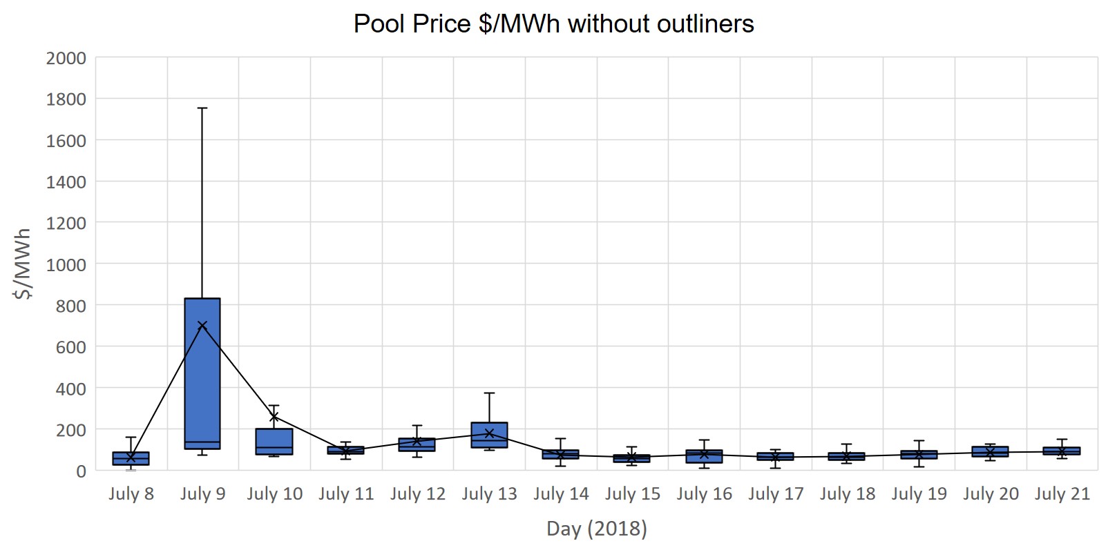
Figure 1. Daily SA Pool price box plot (Data Source: NEMReview)
The SA demand time series shows the typical winter pattern with two clear peaks per day: one peak in the morning when people wake up and the second when they arrive home after work in the early evening. There is also a short smaller spike at midnight when many hot water services kick in. There was lower demand in the second week, however, this is in part due to the way that demand is calculated with some wind generation (non-scheduled) treated as “negative demand”.
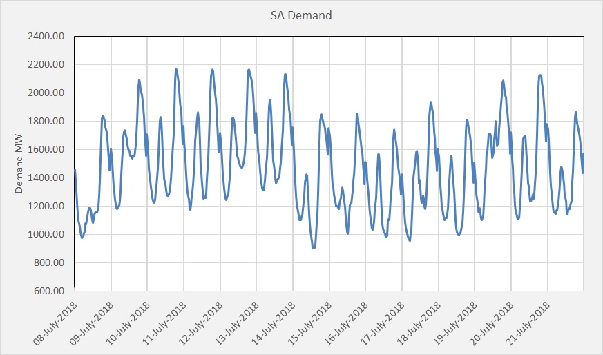
Figure 2. SA Electricity Demand Time Series (Data Source: NEMReview)
The magnitude of the impact of wind generation on the generation mix can clearly be seen in the generation mix chart shown in Figure 3. The wind generation (orange) dropped to less than 200 MW on the 9th July when the transmission line maintenance was inconveniently scheduled. We can see the impact of the transmission line outage on the Heywood interconnector imports (purple) that dropped to zero on the morning of the 9th and the corresponding increase in Open Cycle Gas Turbine (OCGT) generation (lime green) and the Pelican Point generation (maroon). Pelican Point started up on the 9th prior to the outage and ramped up to one unit at capacity during the outage. The second Pelican Point line wasn’t at capacity until towards the end of the outage.
What needs to be pointed out is that the AGL owned Torrens Island Power Station actually significantly reduced output during the outage and then increased again after the outage. This clearly indicates that they set their bid prices very high during the period and were outbid by the much less efficient and higher cost OCGT and diesel generation. However, they benefited from the very high prices for the generation they did dispatch.
The wind generation remained low until the 14th July when it increased to a high level displacing much of the gas generation. The Osborne Power Station came off at this time and remained off for the remainder of the second week.
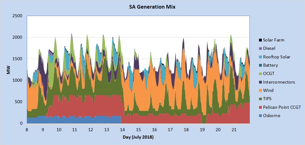
Figure 3. South Australian Generation Mix (Data Source: NEMReview)
Figure 4 shows the daily half-hour box plot for wind generation. The wind was relatively good on the 8th July, prior to the transmission line outage, and then inconveniently dropped away to less than 100 MW during the outage. The wind generation remained low for the remainder of the week until the 14th when it picked up to a high and stable level. Prices in the week of 15th – 21st July were kept relatively low due to the higher and more consistent wind generation.
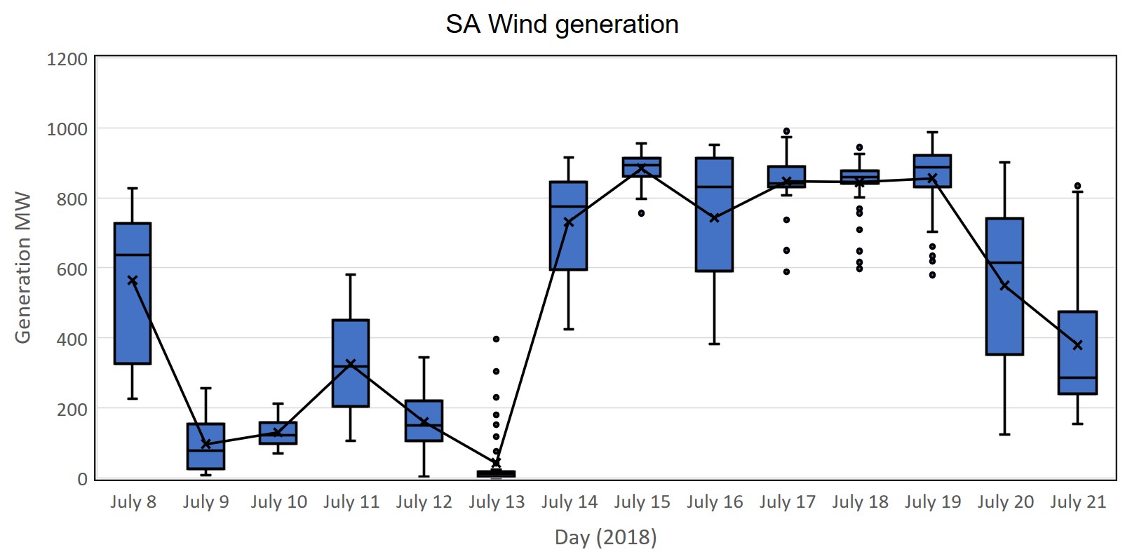
Figure 4. Daily SA wind generation price box plot (Data Source: NEMReview)
The Pelican Point Closed Cycle Gas Turbine (CCGT) Power Station started up on the 9th July prior to the transmission line outage and had one unit operational during the outage. The second unit started up later in the day and ran for almost the rest of the week until the wind returned and one unit was turned off. During the second week, one unit ran at capacity until it came off overnight on the early hours of the 19th due to low demand, good wind generation and likely outbid by TIPS. It restarted just after 6:00am and the second unit was brought online on the 20th of July.
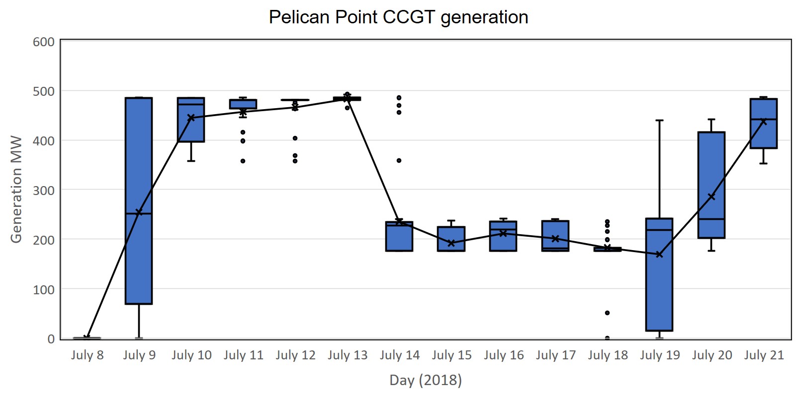
Figure 5 Pelican Point Power Station Daily Generation Box Plot (Data Source: NEMReview)
The usually reliable Osborne Power Station ran consistently until late on the 13th when it switched off, likely for maintenance. It remained off for the second week.

Figure 6 Osborne Power Station Daily Generation Box Plot (Data Source: NEMReview)
The Torrens Island Power Station (TIPS A&B) did ramp up on the 9th compared with the 8th but this was after the transmission line outage. The TIPS output during the outage was an average of 435 MW. It did ramp up all the way to 650 MW after the outage. Obviously, it was outbid by the much more expensive OCGT and diesel generation during that period.
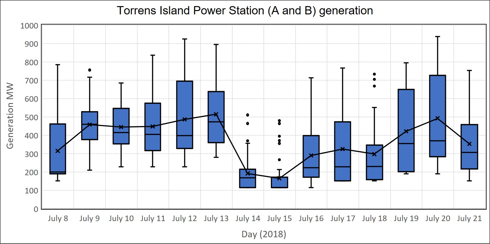
Figure 7 Torrens Island Power Stations (A and B) Daily Generation Box Plot (Data Source: NEMReview)
The Angaston diesel generation plant was utilised far more than it has been in recent times on the 9th during the transmission line outage but it was also used for several half-hour periods during higher prices later in the week. This possibly reflects physical delivery on $300 caps that market participants may have in place.
Figure 8 Diesel Daily Generation Box Plot (Data Source: NEMReview)
Figure 9 shows that Open Cycle Gas Turbines (OCGT) provided much of the support during the transmission line outage. The OCGT utilisation continued for much of the first week until the wind generation picked up again on the 14th.
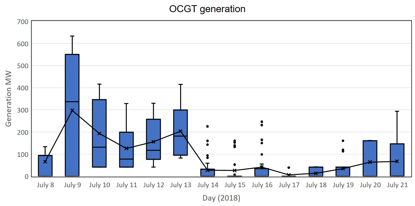
Figure 9 OCGT Daily Generation Box Plot (Data Source: NEMReview)
In the week of July 8th-14th, South Australia was predominantly importing energy from Victoria, as can be seen in Figure 10. In the following week, South Australia was largely exporting energy during the period of higher wind generation. As discussed earlier, at the time of the transmission line outage the larger Heywood interconnector was constrained to export (from SA) only. The small amount that was exported roughly balanced with the imports over the smaller Murraylink interconnector.
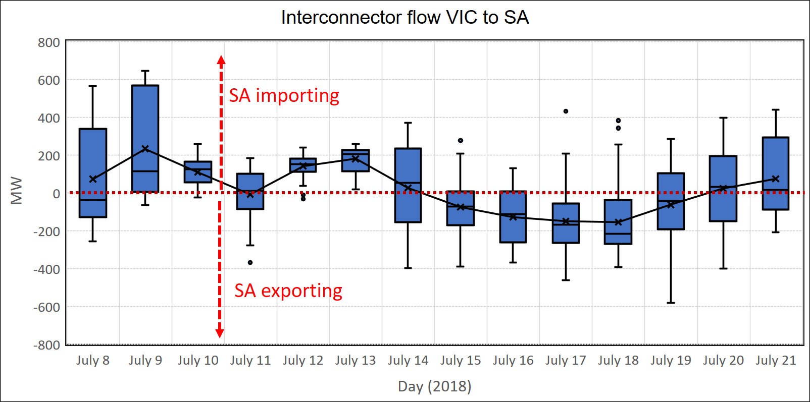
Figure 10 Victoria to South Australia Interconnector Flows Daily Box Plot (Data Source: NEMReview)
The Big Battery provided support during the first four hours of the transmission line outage at an average output of 12.9 MW and a maximum output of 25.6 MW.
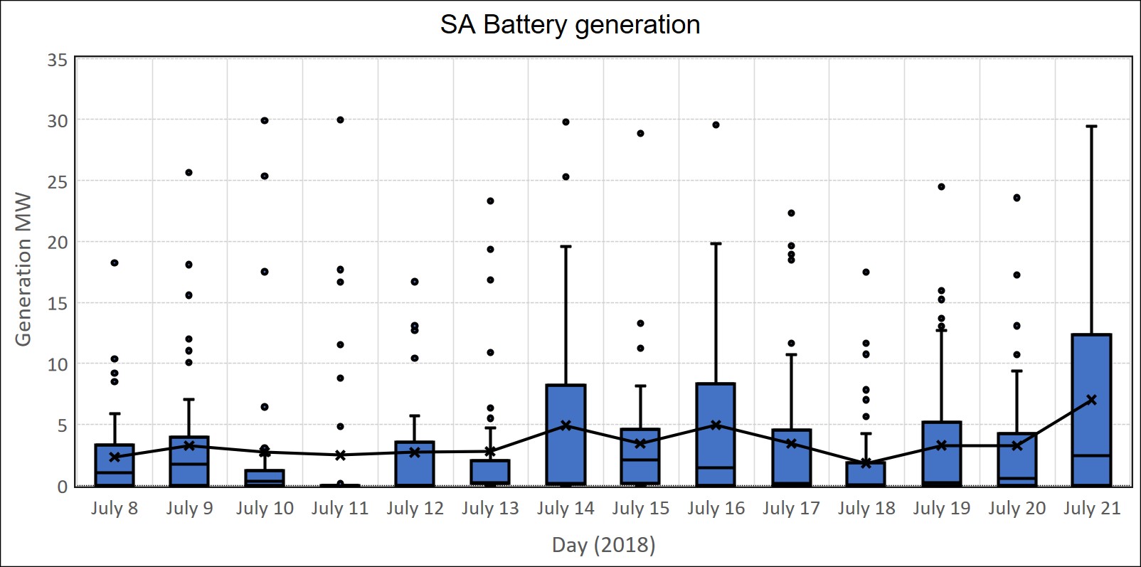
Figure 11 Battery “Generation” Daily Box Plot (Data Source: NEMReview)
Figure 12 shows a much more detailed look at the period of the transmission line outage on the 9th of July in terms of the generation mix and the resultant prices. Prior to the event, the wind generation had already dropped away and there was a significant amount of energy being imported from Victoria. Osborne was running with its usual steady output and TIPS was providing a large proportion of the remaining generation and Pelican Point was off. During the preceding 24-hour period prices were relatively low at $90.20/MWh.
Just prior to the transmission line outage and the Heywood interconnector being constrained, Pelican OCGT generation picked up and continued to increase into the outage displacing TIPS generation that had obviously been “outbid”. In other words, TIPS increased their bid prices during this period. Diesel also kicked in and was cheaper than TIPS.
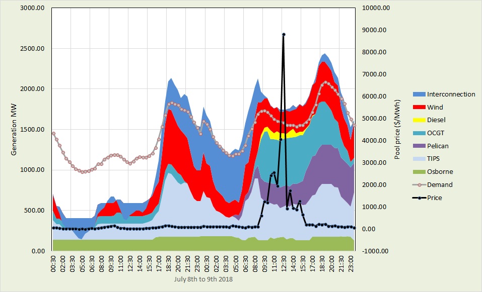
Figure 12 Main generation contributions in SA on July 8th and July 9th and the corresponding pool price (Data Source: NEMReview).
Finally, solar played a passive but important role during the two weeks. The calculated rooftop solar remained largely consistent during the week and contributed several hundred MW of “negative demand” during the peak solar periods in the middle of the day. Without that contribution, several hundred MW would need to have been sought from the not so benevolent generators.
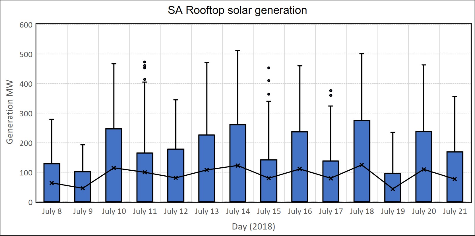
Figure 13 Calculated South Australian Rooftop Solar Daily Generation Box Plot (Data Source: NEMReview)
We have now started to include the output from the newly commissioned Bungala One Solar Farm. This farm is producing up to 25 MW during peak solar periods and obviously had an outage on the 14th and 15th of July.
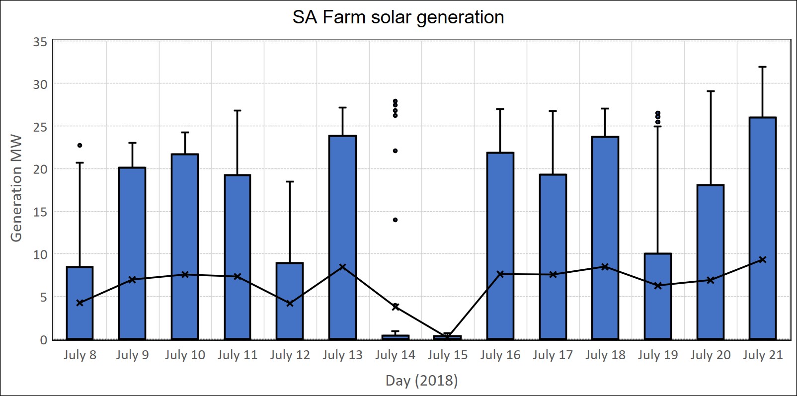
Figure 14 South Australian Farm Solar Daily Generation Box Plot (Data Source: NEMReview)
In summary, the major features of the last two weeks were the impact of a major transmission line maintenance outage at a time of low wind generation and the stark impact of low and high wind generation on wholesale prices. We were able to watch the behaviours of the generators and how easy it was to push prices up to very high levels when wind and interconnector competition is not present.
Why is it important for end users to understand what is happening in the wholesale electricity market, what drives prices and the price patterns that occur?
It helps end users to understand what is happening with prices along with the underlying causes so they can make informed decisions.
For those end users who purchase electricity at fixed retail prices and are concerned about future electricity prices, understanding what is happening in the wholesale market can help them to prepare for and evaluate future retail price offers. Wholesale market prices inevitably flow through to retail prices (plus risk premiums and margins).
Those end users who choose to purchase their electricity through wholesale market pass-through prices can gain a better understanding of how they can manage their risk through load shifting a load curtailment or Demand Side Management.
If you would like to understand more about how the electricity market works and how business end-users can reduce their electricity prices then check out my book Power Profits – A Comprehensive 9-Step Framework For Reducing Electricity Costs and Boosting Profits.
If you would an updated SA market weekly report emailed to each week then drop me a line at michael@altusenergy.com.au