The last week of Autumn 2018, over the period from Sunday 27th May to Saturday 2nd June, has been very interesting for explaining South Australian electricity price action as it was a great example of how generation mix and price change with changes in wind generation. The week was characterised by modest demand throughout the week and a drop off in wind generation in the second half of the week. Overall, electricity prices were relatively low, for South Australia.
The chart below shows a time series plot of half-hour electricity prices over the week.
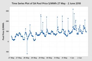
The plot shows an increasing trend as the week progresses with some $200 price spikes from the Tuesday 29th May.
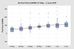
The box plot of this price action by day shows the distribution of half-hour prices within each day of the week and the relative changes. The box plots shows that the average daily price and the median price increased each day of the week and, unusually, into Saturday 2nd June.
The box-plot for the distribution of all half-hourly prices are shown below for the whole week and by peak and off-peak periods.
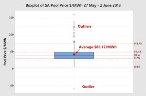
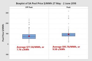
The box plots show relatively low prices and an average of $85.17/MWh or 8.52 c/kWh and a median price of $80.57/MWh or 8.06 c/kWh.
For more information on box plots please see previous blog posts or the book Power Profits.
If we also take a look at the box plot for daily demand we can see that it is not necessarily demand pushing the price up. Sunday 27th May and Monday 28th May were lower compared with the rest of the week and there was the expected drop in demand on the Saturday that did not result in lower prices.
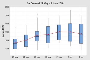
The calculation of demand is a little difficult as it excludes non-scheduled wind generation whereas the wind generation calculation includes both scheduled and non-scheduled wind generation. However, the proportion of non-scheduled wind generation is becoming relatively smaller. So, to some extent, higher demand can be caused by lower wind generation.
So what pushed prices up as the week progressed?
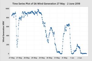
Looking at the time series plot of half-hour periods for wind we can see that wind was strong, around the recent historical median, and relatively steady for the first half of the week and then dropped away quite sharply to very low levels in the second half of the week.
If we look at the wind generation box-plot by day we can see the distribution of half-hour wind generation within each day. The last three days had very low wind generation and on Saturday 2nd June there was largely no wind generation.
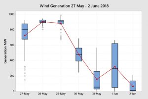
A drop in wind generation by itself does not necessarily lead to high prices, although it usually does. The price is determined by the lowest bid price for the last incremental generation required to meet the demand. The type of generation required to meet demand and the bidding strategy of the owner of the station will determine the price.
Let’s now look at how each of the major power stations and other generation reacted to the drop off in the wind generation.
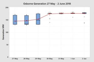
The ever-reliable and consistent Osborne Power Station maintained a reasonably consistent output of the week with a step up on the 30th May when the wind dropped off. In the first three days it would appear that it was out bid by Pelican Point and the Torrens Island Power Station (TIPS) for the last 30 MW of capacity.
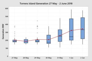
TIPS was also steady for the first three days and ramped up with the drop off in the wind generation.
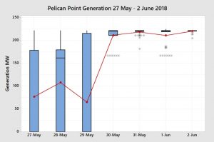
Pelican Point Power Station, with only one unit running, showed a large amount of variation in the first three days indicating that it was ramping up and down to meet demand. It was likely providing the incremental generation required to meet demand in the first three days and setting the price. In the last four days it ramped up to full capacity, for one unit, to respond to the increase in demand with the drop off in the wind. It would not have been the price setter for these last four days.
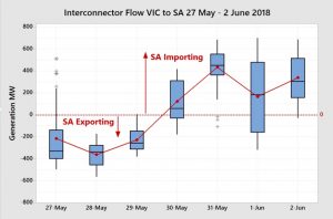
The interconnector box-plot shows that South Australia was exporting electricity for the first three days of the week when wind generation was strong. As the wind generation dropped, South Australia became an importer of electricity from Victoria.
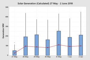
Solar generation was largely consistent for each day of the week except for a more than 50% lower generation rate on Sunday 27th May.
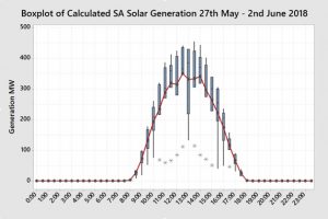
For those that are interested, the box plot of solar generation by half-hour for the week is shown above. In this last week of Autumn, generation started to appear after 8:00am and ceased after 5:30pm, when almost everyone was at work or school.
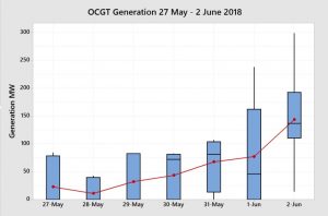
As expected, Open Cycle Gas Turbine (OCGT) generation was low for the first three days of the month and ramped up from 30th May. It was particularly high on Saturday 2nd June. As OCGT generation costs are higher than Combined Cycle and thermal gas power generation their bid prices would be expected to be much higher. The high amount of variability within the day shows that OCGTs were ramping up and down to meet demand and likely setting the price for much of the last four days of the week.
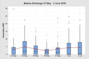
The battery output remains a small but important component of the overall generation mix. Whilst the battery provides an important Frequency Control Ancillary Service (FCAS), it’s output helps to meet demand and reduce the need for OCGT and diesel generation thus suppressing prices.
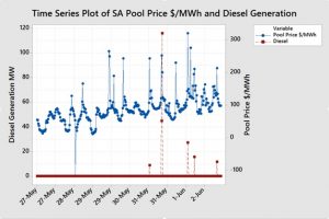
There were very few half-hour periods where there was diesel generation output to meet demand so therefore the data does not lend itself to a box plot. However, a time series plot of diesel generation overlaid with price shows that each half-hour of generation coincided with a higher price spike. Diesel generation was likely setting the price during those half-hour periods. It is unusual though to see diesel output at prices that low.
The chart below shows the contribution of each of the major generation sources throughout each half-hour period of the week 27th May to 2nd June 2018.
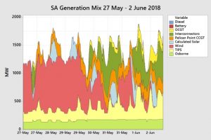
The chart shows the stability of the output of the Osborne Power Station, the large drop off in the wind generation, and TIPS, Pelican Point, the interconnectors and OCGT filling the void that the wind generation left.
Let’s now have a look at demand a different way and examine demand distribution by time-of-day during the working week.
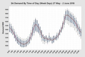
The box-plot of demand by time-of-day shows a clear pattern with very low overnight and early afternoon demand and sharply increasing demand in the early morning and late afternoon. The drop in early afternoon demand largely matches the increase in solar generation.
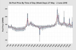
The box-plot of price by time-of-day reflects this demand pattern and we can see predictable price increases during the 6:30am – 7:00am and 5:30pm – 6:30pm periods.
This predictability helps in several ways. It provides information for end users that they can use to plan operations and it also provides an opportunity for the battery to take advantage of a price arbitrage. The battery can charge overnight and early afternoon when prices are low and then discharge during these high demand and higher price periods in addition to other sudden price spikes. Let’s have a look at the time-of-day discharge pattern of the battery.
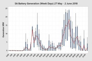
Not surprisingly the battery builds charge overnight and discharges during the early morning and late afternoon peak. “Buy low, sell high”.
So how can all this information assist end users?
Some end users are fully or partially exposed to the spot price. They can use this information to understand what is happening in the market to formulate a view on how market prices will play out for the remainder of the year. End users that are not exposed to the wholesale spot price can use this information to form a view on expectations for fixed retail price offers. They can use this information to schedule operations based on price expectations by time-of-day or plan maintenance days when there are forecast low wind generation and/or temperatures exceeding 35oC.
More importantly, those end users who do not understand the market well can utilise this information to start building their knowledge. They can predict increases or decreases in fixed retail prices and evaluate whether retail prices are fair or not.
My new book Power Profits shows end users how the market operates and they can take advantage of that knowledge. It provides a comprehensive 9-step framework for reducing electricity costs and boosting business profits.
If you would like to learn more, check out the book here, available in hard copy or as a Kindle Ebook.
If you would this weekly report emailed to you then drop me a line at michael@altusenergy.com.au
Acknowledgment and thanks to Paul McArdle of Global-Roam for providing the raw data through the NEMReview software.
