This last week ending Saturday 26th May in South Australia, we saw Pelican Point re-joining the party, albeit only dropping in for a short “drink”.
Based on the data, it appears that the Pelican Point Power Station started up one of their units, after more than one month off, on 24th May. This appears to have helped reduce the spot price and also led to electricity starting to be exported from SA to Victoria.
The chart below shows a box plot for half-hourly spot prices for each day of the week.
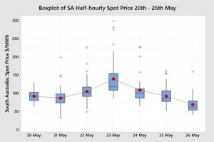
The charts shows an increase in the spot price distribution on Tuesday 22nd May and a significant step up on the 23rd May and then a drop back on Thursday 24th May and subsequent decreases into the weekend. Prices on Saturday 26th May were particularly lower.
Were those price increases and decreases driven by demand? The next chart shows a box plot of daily demand for the week.
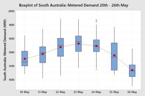
Prices do essentially follow the demand box plot. However, Thursday 24th May has a similar demand distribution as the 23rd May. We have already seen on the price box plot, the price was sharply lower on the 24th. Why?
The demand box plot shows demand increasing through the week until Wednesday and then reducing for the rest of the week with a sharp drop off on Saturday 26th.
The 24th May was the day that the Pelican Point CCGT Station started up one line. The chart below shows the Pelican Point output by day.
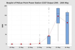
Whilst the average output on the 24th was only 42 MW, it did signal to the market a return to operation.
Let’s have a look at what the other power stations, or generation types, contributed to generation during the week.

Osborne, as usual, had a very consistent output through the week, with a drop off on the very low demand Saturday.
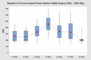 Torrens Island Power Station (TIPS) largely followed the demand but still operated well within its capacity.
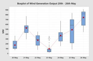
Wind generation was low on the higher demand day, although the lower wind may have contributed to the higher calculated demand. Wind generation was high on the low demand Saturday, helping to push prices lower.
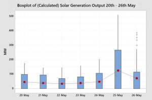
The calculated rooftop solar generation was very consistent through the week except for a jump up in Friday 25th.

This is a very interesting chart, as it shows that SA was importing from Victoria through most of the week, but started to export as Pelican Point kicked in and wind increased on the 25th and 26th.
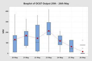
Generally, it is OCGT that set the price, when operating. Open Cycle Gas Turbines help to make up for fluctuations in wind and demand. With Pelican Point starting up on the 24th and the lower demand and higher wind on the 25th and 26th, the reliance on the more expensive OCGT dropped away.
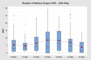
The battery output has been a small but important contributor to the generation mix. The output, on average was quite low at around 5 MW but at crucial times it contributed almost 30 MW of generation capacity.
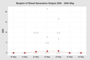
Finally, to complete the picture, it can be seen that the very expensive Angaston diesel fired gas engines fired up for 11 half-hour periods. Interestingly, this was not at very high prices (greater than $1,000/MWh). Let’s hope that there was no soot deposited on the surrounding vineyards.
So, putting this all together, what does the generation mix look like for the total generation mix over the week.
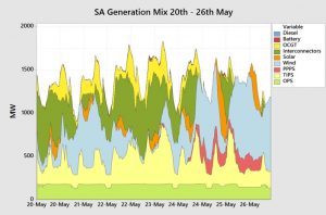
A key feature of this graph shows that the interconnector flow from Victoria to SA (dark green) seems to displace generation output from TIPS (Yellow). However, Osborne (light green) is the quiet achiever in stable, consistent electricity supply to SA.
The wind generation blew away the imports from Victoria, the Pelican Point generation and a large amount of TIPS generation.
Let’s look at the total contribution of the various generator types over the week.

Wind is the largest contributor to electricity generation in SA followed by efficient gas generation and then the interconnectors.
So how can this information assist end users?
Some end users are fully or partially exposed to the spot price. They can use this information to understand what is happening in the market to formulate a view on how market prices will play out for the remainder of the year. End users that are not exposed to the wholesale spot price can use this information to form a view on expectations for fixed retail price offers.
More importantly, those end users who do not understand the market well can utilise this information to start building their knowledge.
My new book Power Profits shows end users how the market operates and they can take advantage of that knowledge. It provides a comprehensive 9-step framework for reducing electricity costs and boosting business profits.
If you would like to learn more, check out the book here, available in hard copy or as a Kindle Ebook.
