
This week, the Southern Hemisphere Winter Solstice and low wind combined to push wholesale electricity prices up. Demand jumped up with a combination of cold, winter weather and low wind generation and the lack of wind generation encouraged more Open Cycle Gas Turbine (OCGT) generation, Victorian imports and even some diesel generation.
Figure 1 shows the time series plot of demand for the week with demand reaching more than 2200 MW four times during the early evenings as people arrived home to their cold houses and turned their heating and cooking appliances on.
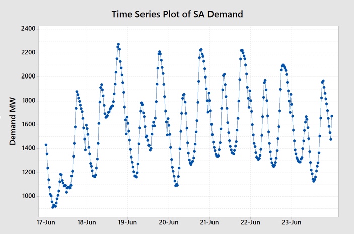
Figure 1 SA Electricity Demand Time Series (Data Source: NEMReview)
The 21st June was the Southern Hemisphere Winter Solstice with the shortest day of the year signalling the depths of winter. Minimum temperatures dropped to as low as 3.5C which is quite chilly for this Mediterranean type climate. Compounding the impact of the cold weather was a significant drop off in the wind compared with the previous week.
Figure 2 shows the time series plot for wind generation with the drop off in the wind evident.
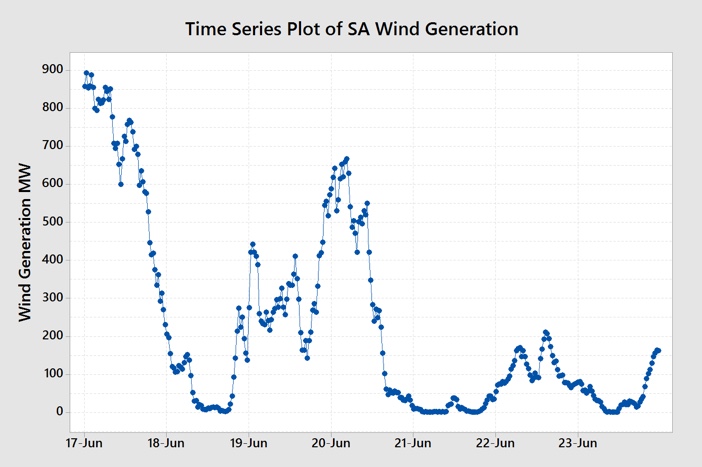
Figure 2 South Australian Wind Generation (Data Source: NEMReview)
Figure 3, the box plot for daily electricity prices, shows the impact of the cold weather and low wind combining.
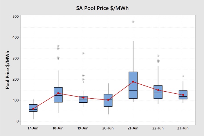
Figure 3 Daily SA Electricity Price Box Plot (Data Source: NEMReview)
There was only one day of the week where the median and average prices were below $100/MWh and that was Sunday 17th June with lower weekend demand and good wind generation. As the wind dropped away on the 18th June prices increased and not just during the high demand periods. Prices jumped up sharply on the 21st June as wind generation was almost non-existent and more expensive forms of generation came in to meet demand. Prices moderated on the 22nd June when wind generation picked a little and demand was lower. Saturday 23rd June also saw prices above $100/MWh despite being a weekend day due to the low wind.
Despite demand being relatively high, there was still significant generation capacity to meet demand. The extent to which that capacity was made available and the generators bidding strategies determines the price. So let’s now have a look at how the different power stations or generation types responded to the lack of wind.
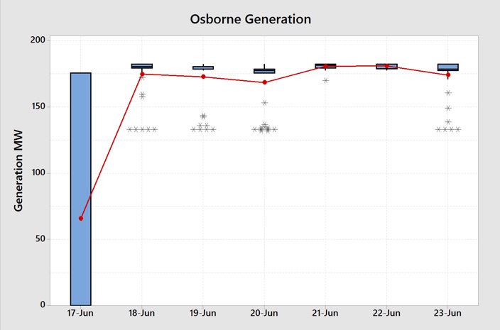
Figure 4 Osborne Power Station Daily Generation Box Plot (Data Source: NEMReview)
The Osborne Power Station, usually very steady and consistent had reduced output on the 17th June either due to a planned outage or it was outbid by the Torrens Island Power Station. It remained very steady at around 180 MW for the remainder of the week.
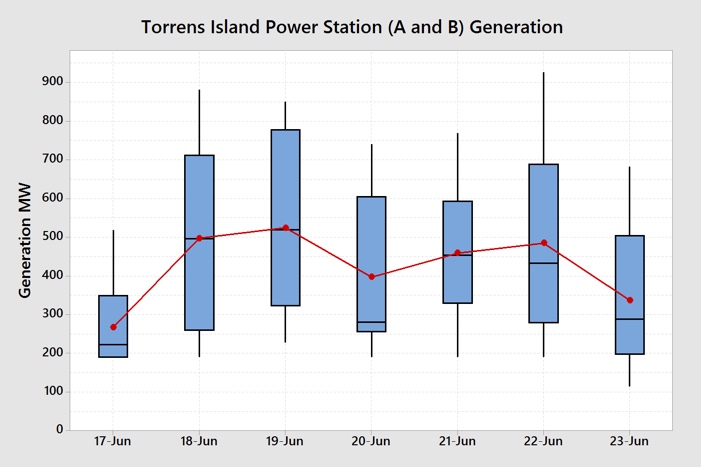
Figure 5 Torrens Island Power Station Daily Generation Box Plot (Data Source: NEMReview)
Torrens Island Power Station was the only generator used to meet demand, along with wind, for most of the 17th June. This was likely due to it’s bidding strategy being designed to have at least one of its boilers at both Torrens Island A and Torrens Island B operating. The large size of the boxes for the remaining days shows that it is ramping capacity up and down to meet demand. This additional ramping capacity was priced above the Osborne Power Station bids and Pelican Point Power Station bids as we will see in Figure 6 below.
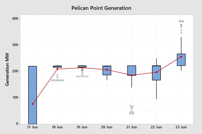
Figure 6 Pelican Point Power Station Daily Generation Box Plot (Data Source: NEMReview)
Pelican Point was also outbid on the 17th June but ran relatively stable for this rest of the week. However, significantly, the second unit at the Pelican Point Power station was woken out of its slumber on the 23rd. Hopefully, both units will continue to operate throughout the remainder of winter to keep offered capacity up and prices down.
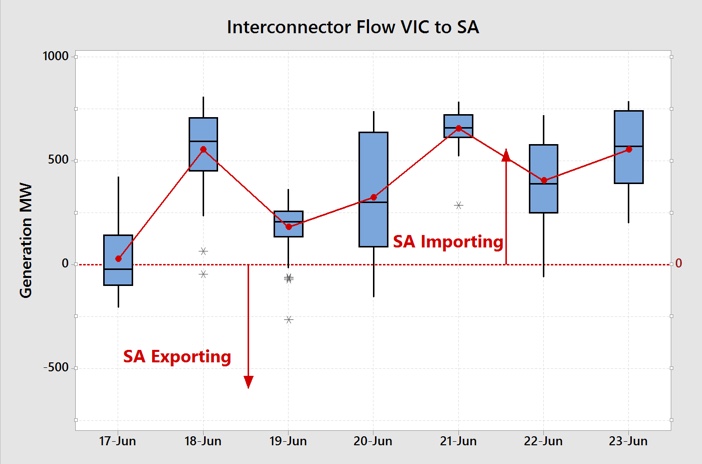
Figure 7 Victoria to South Australia Interconnector Flows Daily Box Plot (Data Source: NEMReview)
With the lack of wind generation and the subsequent higher prices in South Australia, electrons were attracted from over the border with South Australia importing electricity for most of the week from Victoria.
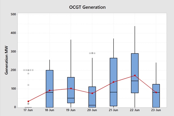
Figure 8 Open Cycle Gas Turbine Daily Generation Box Plot (Data Source: NEMReview)
There was a large reliance on OCGT generation during much of the week. As this type of generation is more costly than the more efficient CCGT and thermal gas generation, their bid prices are generally much higher and so set the half-hour price at much higher levels.
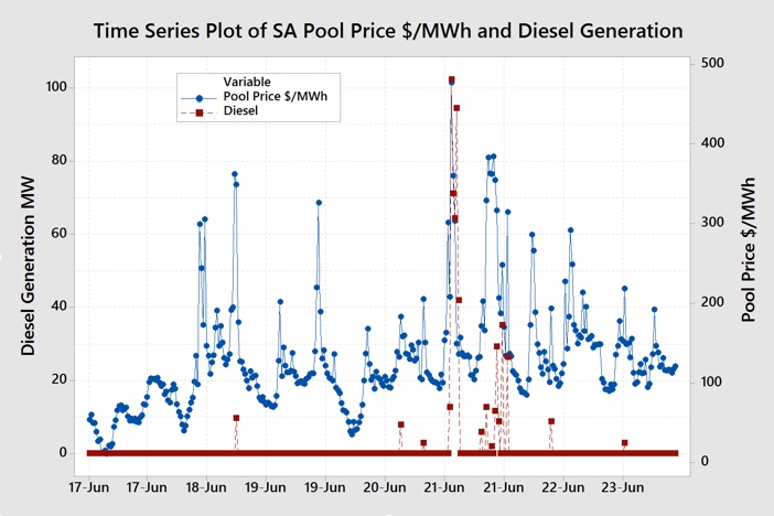
Figure 9 Diesel Generation Time Series Plot (Data Source: NEMReview)
Figure 9 shows that the higher prices attracted some diesel-fired generation. It can be seen on the chart that in the half-hour periods where there was diesel generation (amber trend) that half-hour prices (blue trend) were usually much higher. What is important though is that usually, diesel generation would normally set the prices at much higher levels. It is possible that the Big Battery, shown in Figure 10 below, is displacing much of this higher priced generation.
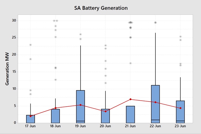
Figure 10 Battery “Generation” Daily Box Plot (Data Source: NEMReview)
In some half-hour periods as much as 30 MW is being discharged from the batteries, as seen in some of the outliers.
Finally, behind the meter rooftop solar generation continues to play its part in reducing demand as shown in Figure 11.

Figure 11 Calculated South Australian Rooftop Solar Daily Generation Box Plot (Data Source: NEMReview)
Figure 12 shows the total generation mix throughout the week.
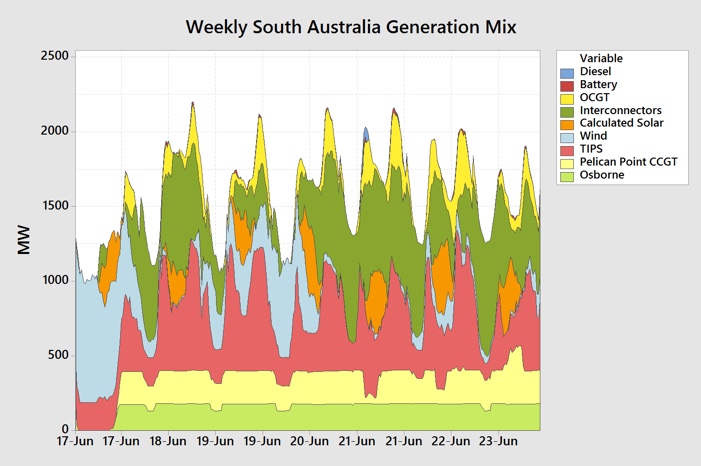
Figure 12 South Australian Generation Mix (Data Source: NEMReview)
Figure 12 shows how wind (light blue) displaced gas generation for much of the 17th June and, as it dropped away, Osborne (light green), Pelican Point (light yellow) and imports (dark green) picked up. The chart also shows OCGT (dark yellow) meeting the bulk of the higher demand peaks and the battery (morone) and diesel (dark blue) completing supply at the very tip of the peaks.
Figure 13 shows the distribution of half-hour prices by time-of-day through the week.
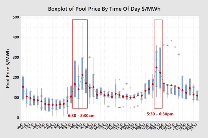
Figure 13 South Australia Wholesale Pool Price By Time Of Day (Data Source: NEMReview)
For those businesses with partial or full exposure to half-hour wholesale pool (spot) prices, shifting load or curtailing during the early morning or late afternoon peaks will assist those end-users to reduce their overall average price.
If you would like to understand more about how business end-users can reduce their electricity prices then check out my book Power Profits – A Comprehensive 9-Step Framework For Reducing Electricity Costs and Boosting Profits.
If you would an updated SA market weekly report emailed to each week then drop me a line at michael@altusenergy.com.au